
ITS ELECTRICITY!!!! GET IT RIGHT!!!!!!!!!!!!!!!!!!!!!!!!!!!Originally Posted by rotebass


Results 51 to 60 of 78
Thread: making your own flyers...
-
08-11-2012, 11:04 PM #51Tech Mentor


- Join Date
- Sep 2011
- Posts
- 231

-
08-12-2012, 01:14 PM #52Tech Guru

- Join Date
- Apr 2009
- Posts
- 1,130
Originally Posted by Deejaesnafu
You are mistaking my attitude for my critiquing your work and views. Again, if I misunderstood, and you have a sincere desire to learn, keep at it. Your skill level has a long way to go, and there's nothing wrong with that. No one is ever really good when they start at design.
If you are just looking for a way to avoid paying a professional because you just don't want to pay for quality work, I stand by everything I previously said. Don't let your ego get buthurt because your amateur work looks... amateur.
If you really want to see some of my stuff, fine. although I already know where this is gonna go, but ok... I'll take your bait.


-
08-12-2012, 01:31 PM #53Tech Guru
- Join Date
- Apr 2009
- Posts
- 1,130
and here's a couple of non-music related pieces I did.

-
08-12-2012, 02:03 PM #54Tech Student
- Join Date
- Aug 2012
- Posts
- 4
You need Adobe Photoshop lad pluss massive skills some one said use paint that was funny part LOL
-
08-12-2012, 02:05 PM #55Tech Guru

- Join Date
- Jul 2011
- Posts
- 1,376
yah yah and i suppose you do this all for free right? did everyone miss the part where im not gettin paid alot for this, its at a small venue and i dont think it merrits a full color rave style flyer? yall "pros" are seriously hurting for work when you feel like a gig/flyer of this magnitude are cheapening your expertise in some way. Originally Posted by sobi
ive always been into art, so sure id like to learn as much as possible about design within reason, but yes i am trying to avoid paying a designer more than ill be paid as DJ on this particular gig. i honestly cant see why anyone would get so worked up about it.
p.s. nice stuff sobi... for what its worth
heres my actual flyer...bash away.. it was the best i could do for now
-
08-12-2012, 02:47 PM #56Tech Guru
- Join Date
- Apr 2009
- Posts
- 1,130
Look into trying to fish around for some design students. Chances are they will do it for next to nothing... and probably less. Not only that, but you are bound to find some great talent. Sorry, but I get defensive about skimping on this stuff. I've been blessed to make a living as a full time DJ at one point of my life, and moved on from that to being a full time graphic artist/photo editor. While it hasn't taken away my ability to provide for my family, I can't make nearly the amount of money people in any of the previously mentioned fields used to make. Yes, you have to adapt and change with the times, and I have.
That being said though, the ease of access to new tools means you no longer need to invest so much money. That in turn no longer weeds out people without an extreme passion for the craft. Because of that, a slew of people with only one foot in flood the market, they do their thing, and they disappear shortly after. That leaves the people who really love what they do, living in a position where the bar is lowered (along with pay).
End of the day, I have always had a burning passion for music and art. It has gotten increasingly harder to make a good living at either. Even when you are good, and the creme rises to the top, the fact of the matter is that quality is always out numbered by mediocrity, and now those ratios make the quality harder to spot, and it lowers the public perception of good work.
-
08-12-2012, 03:30 PM #57Tech Convert
- Join Date
- Jul 2012
- Posts
- 10
i agree whole heartedly with what you said, i actually hate how easy it is for people to dismiss a graphic designers work and to try make up something themselves only to be left with trash for posters or logos etc. you can spot this kind of stuff from miles off and it pisses me off everyday seeing it, where as i have to spend time and effort into designing. Originally Posted by sobi
on the other hand however, forgive me if im picking up the wrong vibe over the argument but your stuff looks horribly amateurish too so i dont know why your giving out to him about it.
-
08-12-2012, 04:00 PM #58Tech Guru
- Join Date
- Apr 2009
- Posts
- 1,130
Pease elaborate. Part of growing is taking criticism and learning from it. I'd like to hear specifics and pick your brain to see what might be weak. Originally Posted by adambroe
-
08-12-2012, 05:01 PM #59Tech Convert
- Join Date
- Jul 2012
- Posts
- 10
ah let me see if i can give some critique,
http://img.photobucket.com/albums/v1...mB_koji_v2.jpg
i like the logo part in this the 'gg' is interesting but the serif typeface you've used doesn't really fit along with the design, the type face is very formal for this kind of design and doesnt really mix well, the lines you've put over the 'gg' are also very unnecessary and only make it look needlessly busy. youve left acres of space below all the type too which gives the feeling of it falling down which is never good you want someone reading a poster to get a settled feeling so they take the info in better. i realize you were trying to show off the red vector as the main image but to be honest ive always hated these things, they are nice to look at on their own but in posters they just look way too busy and distracting, which is what i think is mainly wrong with this here its just too busy. the gramophone? part you put over it with the gradient overlay is way too bright too, it doesnt fit in with the rest of the design and kind of takes away from the aesthetic. less is more man, i hate that fucking phrase but its true. the koji logo is interesting but the blurred effect you went with also doesnt really fit with how the rest looks either, its not as crisp. the main koji logo should have been solid too rather then have been overlaid on. the two red lines coming down over it too make the main image look a bit off centre which always pisses me off when im designing something, i need the stuff to be centred. i like the colour scheme tho.
http://img.photobucket.com/albums/v1...isane_1980.jpg
i like the tisane logo here but you really need everything to be perfect if your gonna try this kind of style, for example the horizontal lines on the 'T' arent the same size as the vertical ones on the bottom. its little things like that that makes stuff look a bit crappy, details need to be perfect. the '8' also is crossing over into the 9 and the 0. there shouldn't be those kind of mistakes.
you have a good colour style again in this one and i like the crossing lines effect but youve cut off the hair of the two girls on top and i hate the lens flare too which your using to cover what ever was in between them.
all in all i think youve made it a bit too busy in the center of this image.
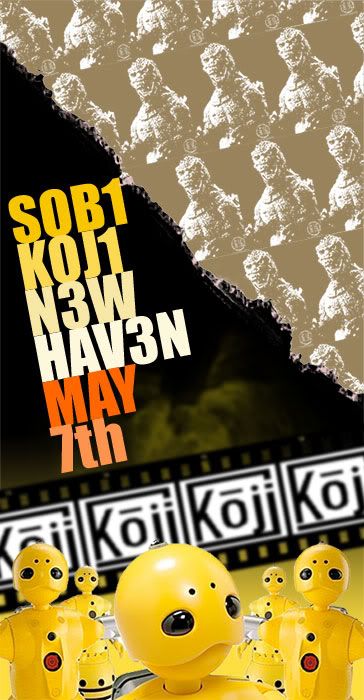
http://img.photobucket.com/albums/v1...en_1000507.jpg
i think youve kind of messed up the colour scheme in this one tho, the yellow is nice but it doesnt fit with the brown of the godzilla part too well. that dirty yellow of the smoke behind the type is a horrible colour too and the koji is way too blurred compared to the robots.
the angled type is interesting but its way too close it just looks like a block and the seven is completely off from the line of type you were following
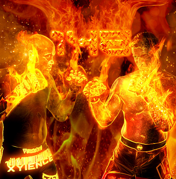
http://a.espncdn.com/photo/2012/0702...fc_148_614.jpg
no offense but this is one of those beginner photo manipulation tutorials like this (http://psd.tutsplus.com/tutorials/ph...-manipulation/) something like glowing edges, gradient, overlay job done. you kind of need to back off with the effects, theres no real room to breathe in the image.
the type is interesting but again you've done way too much with it ( i can make out the 1 and the 4 but im still not sure if thats supposed to be an 8 or not)
everyone likes to do fire because its cool but this kind of image is just bog standard beginner stuff where someone discovered photoshop, played around with too many effects and thought the end result was cool
http://img.photobucket.com/albums/v1...-game-2011.jpg
same kind of thing here, its just basic pasting the figures down and messing with gradient blur i think? and with the liquify tool for the 'ghosts behind. the figures are too bright to fit in with the image too
its a lot of just basic stuff youve been doing, which isnt bad you're just making your images too needlessly busy. if you dont already spend half your life on the internet like i do id suggest trawling some sites like:
http://www.fromupnorth.com/ (which is great for everything, especially photo manipulation, typography, graphic design etc)
http://lookslikegooddesign.com/
http://abduzeedo.com/
http://www.behance.net/
or the millions of other design and art blogs, and taking some ideas from the images you find and incorporating it into your work. seeing all the best the internet has will give you a better aesthetic understanding too as well as new ideas for designs and stuff....
now thats just my opinion im not saying im perfect at anything either.
-
08-12-2012, 05:38 PM #60Tech Guru
- Join Date
- Jul 2011
- Posts
- 1,376
ok adam , lets see some of your work now please :P you cant give that kinda feedback and not leave an example.
on another note im wondering if you guys adhere to the same "professional only" motto when looking for a date......


 Posting Permissions
|
|
© 2023 DJTechTools
Bookmarks