Opinions on my concept DJ logos
Hey guys what do you think of these logo concepts I had made


UPDATED LOGO 7/17
Opinions on my concept DJ logos
Hey guys what do you think of these logo concepts I had made
UPDATED LOGO 7/17
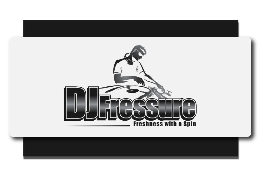
Second one is the best… But drop the “Freshness with a spin”. It’s a little cheesy.
Quite like No. 6 - but the “freshness with a spin” tag line HAS to go, mate…
Yeah I was debating on it, it doesn’t seem quite right. Its something I would put on the back of a shirt
To be honest, I think they all look a little bit too cliched. especially the ones with a DJ in them..
Do you guys think I should drop the DJ? Or keep it?
depends what you play, the "freshness with a spin’ is awful and the images look cheesy
I play House, Top40, and Hip Hop
I would head back to the drawing board, and try to come up with something a bit more abstract, and a lot less cheesy lol. (NO Freshness with a spin or clipart looking images)
That kind of went without saying…
get a cool font from www.dafont.com use inkscape, photoshop or gimp, and remember that when it comes to logo’s keep it as minimal as possible and try to avoid too many colors and shading, monotone is usually best.
Don’t put it on the back of a shirt - it sounds like an advert for washing powder.
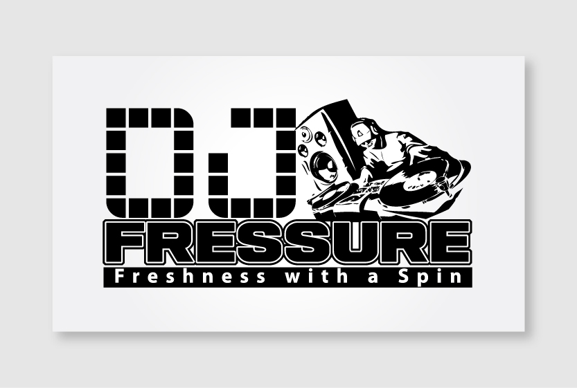
3 & 4 are the only ones identifiable at that small of a size, and therefore, the only ones you should consider. Before you tell me they can be clicked on to see a larger size, I realize that. My point is that one of the keystones of a good logo, is that it is legible at the smallest size. The preview sizes up top pretty accurately represent the size they would be on a flyer.
+1
#4 without freshness saying
LOL
Everyone seems to like number 4 it seems like. Should i just keep that make the letters with no gradient
The last ones might be ok for what you play, I think it is all too busy, and would be better served elegantly blocked with shapes that represent the record with a circle, than an actual record. Freshness with a spin, needs to be dropped or worked into something doesn’t make me think of fabric softener. I think if you move away from images and focus on the text over all you will come up with something better.
I support the idea of Dj logo to be minimalistic as possible! here is mine http://goo.gl/FRhBC (lion head, cause my zodiac sign is lion) and http://goo.gl/bve6H for my DnB moniker (the head is there cause i have a simillar looking mask for it ![]() ), play with the font, to produce some nice, clean results
), play with the font, to produce some nice, clean results ![]()
Stick with something simple, try just doing a cool looking font without going overboard on the typeface and effects.
Finally someone who understands - all these logos are weak, as at the preview size on this very topic they are completely un-readable.
A logo has to be clear at ANY size, see; Apple, Nike, Mc.Donalds etc
