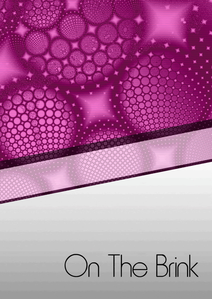
Hey Guys im starting a Darkpsy/Full-o Psytrance night in october and ive decided to begin to start designing the flyer for the event im not great at art or nothin so i kept things basic yet eye catching (i hope ) could you guys please let me know what you think, all input is greatly welcome cheers D2D
don’t use the first picture. at first glance i couldn’t even tell that the random shapes were text. you have to make your typography easy to read so that people don’t have to strain to understand what they’re looking at.
but the second picture is pretty nice for the most part.
-cut out the “bass +treble” words it’s confusing and distracting. If you need to keep it atleast lower the opacity or use smaller font so that it doesn’t draw the eye away from the important text.
-add some light texture to the background. the flat grey is boring if you’re just using Text and no other imagery to capture the eye.
ill start to make a few changes then i did come up with a more clear flyer but accidently fattened image so cant get the rear of the flyer how i would want even tho i do think it was a better design im just stumped on what to do with it. heres what it looked like if your interested hehe
Mate, i would use the second one, minus the bullet holes and volume images, and find a cool psychedelic or tech background, overlay the text etc on that and jazz it up a bit with drop shadows etc. I’ve been to a lot of psy parties and most of the flyers are pretty simple looking but effective. looking forward to seeing the final result dude
seriously..sitting here staring at my tables…mixing the same 5 vinyls.. you may not hear from me for a while after i get that audio 8.. i’m going through withdrawals
Id say never use Photoshop Filters that have been done to death like “Extrude”.
The thing with Flyer design is , its all relative to the Genre.
The D&B scene uses design that would not be use by the House scene and blah blah.
Its all about whats relative but forward thinking at the same time.
The Indie scene in UK has gone back to that whole cut n paste , marker pen , hand drawn thing. Its boring but thats the way it is. Some time ago all flyers had animals on them. Try to avoid cliches and never have a picture of a turntable on a flyer hahaha
Hey guys thanks for input, i did think the typeface in the first flyer i posted was a little confusing myself but thought it added a trippy edge to the front but in the end i didnt realy think that flyer looked good with other fonts on my pc. so in the end i scaped the whole thing and started afresh. Im trying to keep the flyer simple yet eyecatching as i said in first post but i am still a photoshop noob hehe. i do like your flyer djhipnotikk very underground feeling like the night will be but i can’t do that kinda stuff when i try
I find having just to stick to one type of design due to the scene very hard to do as so many things are visualy apealing and i generaly like alsorts of flyers ive seen over the years and just thought id try something different to the usual just to be slightly different from the rest, but i do see your point and will try to address it in future designs i try speaking of which hehe heres what ive been working on this time.
im a professional graphic designer and i used to work as a fulltime flyer/club designer for 3 years (worked and still do some stuff for club exit www.myspace.com/exit and worked for club pacha vilnius for about 6 months). IMO you should avoid cheesy ambient-ish backgrounds or do them more simple.
don’t use those extra-fancy-matrix-like fonts and those techno-wannabe fonts. go with the classics first (helvetica was my favourite for a long time, avantgarde bold is great as well) until you feel strong and can judge if the font is good or bad. i know it sounds stupid, but that’s the way it goes
my portfolio (tho i havent updated it for more than a year now) www.vytisgruzdys.com
and my blog about flyer design www.flyingflyer.net . in the blog you can find some nice inspirations!
hope it helps!
and we should keep this thread alive as flyers are one really important part in club scene. it reflects the club. if i get shitty flyer i usually dont even look deeper into it.
not meaning to thread jack..but would you mind critiquing my designs? i’ve used some of these publicly, some of them are waiting to be used..but here are some:
i dont think that anyone would mind you showing your designs!
ok. i try to make it short and simple:
you use way too many fonts in one flyer. it really distracts.
text has too many colours. i mean each dj written in different font, different colour or even colour patterns. it also distracts.
all information is written in the same size, every object looks as important as the next object. it shouldn’t be like that. the first thing that should catch your eye is party name/headliner dj. then support djs, then venue+date and all other info. write headliners in 2,3,4,5 times bigger font. if headliner is not a superstar, that way people will think he is anyway
your designs look loose. like you took different objects from different flyers and put them all in one space. i mean there’s no link between let’s say an arrow, paint drip and font. it all should stick together. and i would avoid the ‘traditional’ flyer attributes like arrows and stuff. drips still do the job sometimes.
the colour schemes are loose as well. try to google for colours that match good. you will get that really fast, it’s easy!
the best flyer from the ones you’ve shown is http://indydesigns.net/img/studiofest.jpg
text sizes are ok except the price and address, they are too big.
colour scheme is nice. font colour stays the same - good!
im not a fan of that kind of font, but it looks quite good.
i don’t like that in the upper part you use orange dynamic object and in the lower part you use red static lines. i would use the same orange theme in the lower part as well.
Hey man i took a look at your portfolio, your stuff is really dope. Do you have any advice for people who want to get education/training in graphic design? I’m actually in the process of looking into schools for design and I’m trying to decide between taking a 4 year university program or a condensed 1-2 year intensive at an art college. Any tips for choosing the right program/school?
hey guys thanks again for input, gonna try putting new font into the dj’s part the letter ‘I’ aint showing very well ive noticed, been trying a more trippy design out this evening with the input of my fellow promoters and seems ok so far. nice stuff in the portfolio dude wish i had good design skills hehe
getting date for the event on tuesday too so gonna have to try sort something out for certain flyer wise so i can get promoting, we have got an ok amount of people interested in our night too, we have been throwing outdoor partys for past few months and its kicking off more than i thought had 150+ people at first real party as some we just had a big group of friends, we are having another outdoor gig on friday and from whats being said its gonna be anything up to 300 people this time.
no but seriously thanks for the time, i really do appreciate the feedback. i don’t really consider myself a pro at flyer design, but graphic design has always been a passion of mine, though i may not be professionally schooled in it
but anyway, new design is lookin spot on brother, i’m diggin it.
 im starting a Darkpsy/Full-o Psytrance night in october and ive decided to begin to start designing the flyer for the event im not great at art or nothin so i kept things basic yet eye catching (i hope
  ) could you guys please let me know what you think, all input is greatly welcome cheers D2D


 seriously..sitting here staring at my tables…mixing the same 5 vinyls.. you may not hear from me for a while after i get that audio 8..